With roots in the Bismarck-Mandan area, Capital Credit Union has been serving North Dakotans since 1936. Now, with a bright new brand and support from InterOffice, they are branching out into Fargo.


When it came time to build their second Fargo location, Capital Credit Union knew that it couldn’t be just another branch for the organization. According to Vice President of Marketing Jill Lagasse, Capital Credit Union needed to create something truly special to attract and retain new clientele in the growing Fargo market. 

“We wanted this location to be our flagship branch in Fargo,” Lagasse said. “We’ve been in Bismarck-Mandan since 1936. We have very high market penetration there,” Lagasse said. “In Fargo, nobody really knew us. We needed that jump. We needed that spark. We needed something to attract people and create a place that they want to be affiliated with.”

Step one in creating a flagship Fargo branch was identifying the right location. Fortunately, several years prior, Capital Credit Union’s board of directors had chosen to purchase a plot of land in what was then an undeveloped part of South Fargo. 

“Our board had the vision and the foresight to buy that piece of land in Fargo many years ago, and their vision couldn’t have been more spot on,” Lagasse said. “The surrounding area has developed tenfold since we bought that land. It’s an excellent location in Fargo with tons of visibility and very high traffic.”

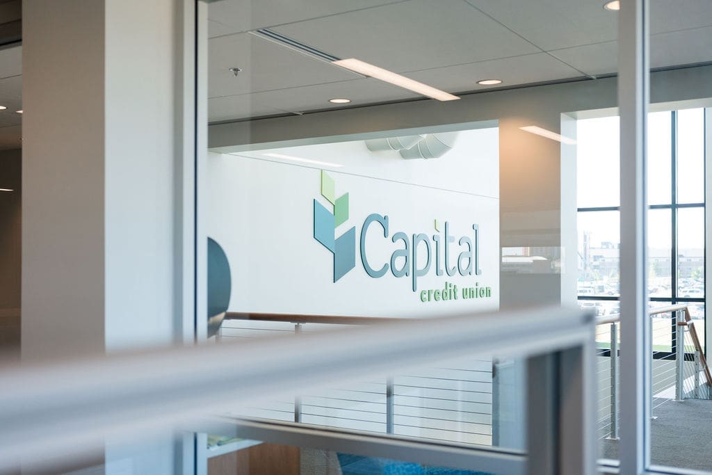
Capital Credit Union’s 11th branch, located on the corner of 32nd Avenue South and Veterans Boulevard, opened to the public in April 2020. With a prime location on two bustling streets and large signage on all four exterior sides of the building, it serves as a billboard for Capital Credit Union.

But it wasn’t enough to catch people’s eyes as they drove by. Step two was to create an interior environment where, once they walked in the door, people wanted to stick around.

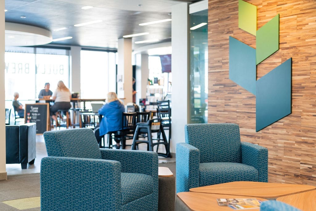
Capital Credit Union underwent a significant rebranding effort in 2018. While the name remained the same, the credit union’s logo and color palette were transformed. Dated golds and beiges were replaced with bright, welcoming shades of blue and green. As Capital Credit Union’s first new build since 2018, the Veterans branch was an opportunity to breathe life into that new brand.

We needed that spark.

“This building was our very first time that we were able to extend our brand into our facilities through wall color, architecture, furniture, and signage,” Lagasse said. “We’re still Capital Credit Union, but the inside of the branch could not be more different.” 

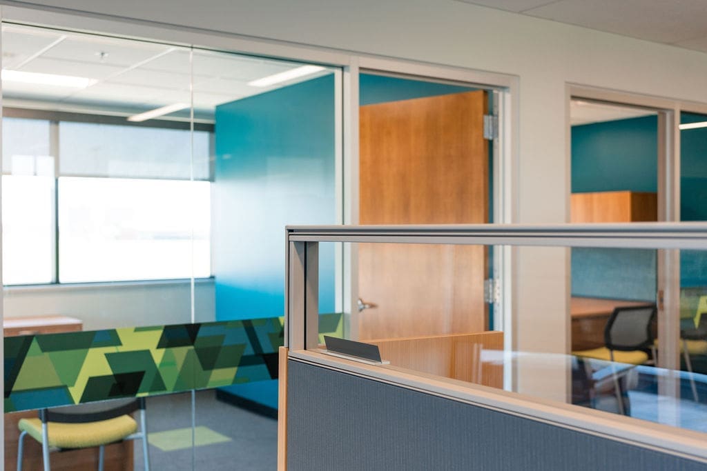
Integrating the brand’s new color palette through paint colors, flooring, and furniture required many–including Lagasse–to step outside of their comfort zones. Upon walking in the door, guests are greeted by an apple-green accent wall. Beneath their feet, the traditional gray carpet is broken up by squares of another, lighter shade of green.

And when it came time to select furniture, Capital Credit Union contacted InterOffice’s Workspace Expert Kyle Hellman, who then teamed up with Workspace Expert Jolynn Kaldor to suggest colors that go with the rebranding.

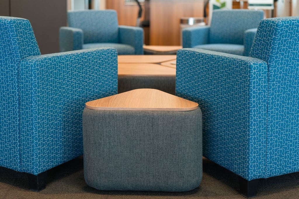
“We’ve never been this creative with our facilities. All of our furniture before was much more ‘vanilla,’” Lagasse said. “InterOffice played a huge role in taking those four colors of our logo and incorporating them in our furniture. They gave us so much advice, insight, and confidence. They were able to match our logo colors in a way that is light, inviting, and does not clash.”

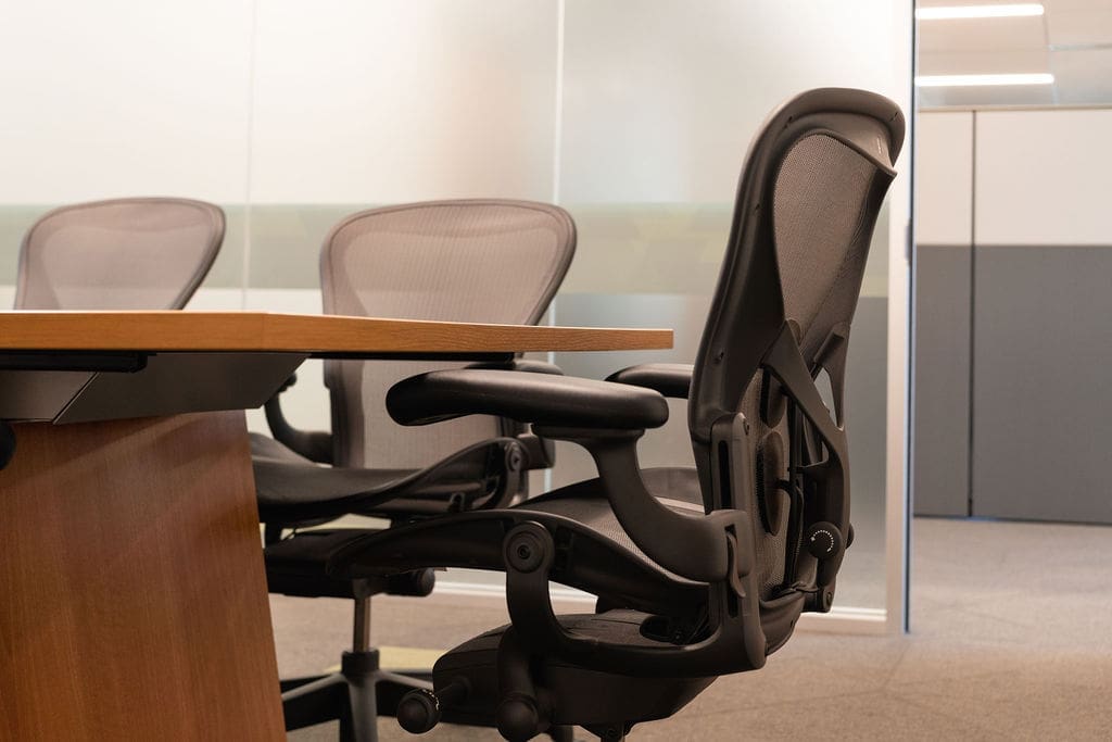
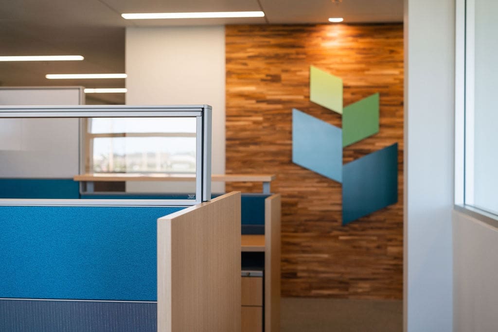
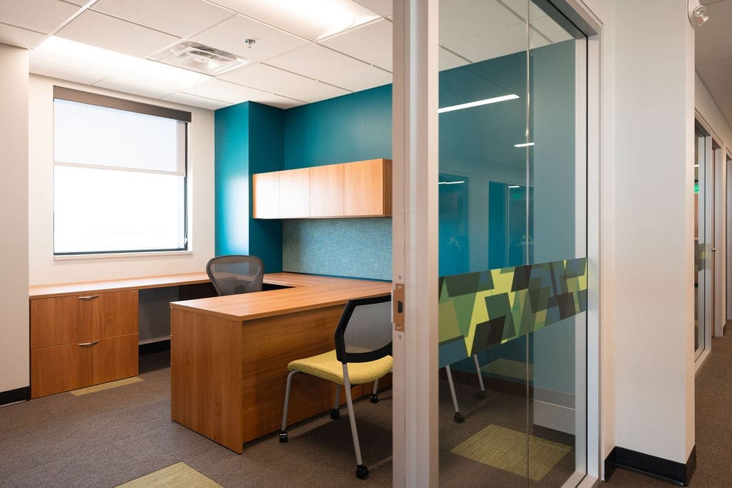
Capital Credit Union did not utilize any existing furniture for their Veterans branch, instead bringing in all-new JSI Vision Series desks and Herman Miller Canvas workstations for the offices. Hellman challenged Capital Credit Union to think outside the box for their lobby, suggesting vibrant green Exemplis Focus Side Chairs and blue Exemplis Composium Sharp & Nano Lounge Seating.

While there were some initial doubts about the contemporary color palette, Capital Credit Union put their trust in InterOffice–and the result is an environment that is bold and exciting, yet still comfortable and timeless.

“From the furniture to the floors to the walls, it looks so different from anything we have in any of our other branches,” Lagasse said. “Now it’s our prototype, so as we’re remodeling other branches out west, we are literally using the same finishes and furniture from Veterans. We’ve gone through the work of selecting the wall color, the accent colors, the wood trim, the furniture, so now those remodels are easy.”

Capital Credit Union wanted to create a functional billboard for their Fargo market, and with some intentional foresight, a bit of trust, and the right partners, they have been able to do just that. 

“We’re meeting our growth goals in Fargo, and we couldn’t have done it without this branch and the rebrand,” Lagasse said. “I can’t imagine a better partner. We needed a true partner to walk with us on this journey, and that’s what InterOffice gave us.”